Student Blog: Animals Go To Broadway
No, I’m not talking about Sandy, Bruiser, or Milky White. I’m talking about my mediocre Photoshop skills…
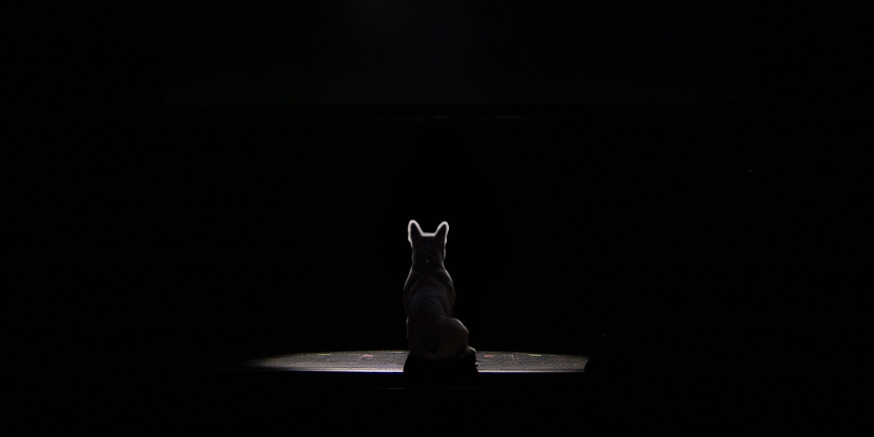
Welcome to my latest installment of “What to do this summer?” If you read my blog post last month, you know that one of the things that I wanted to do this summer was to learn something new. That’s how I came up with the “Animals go to Broadway” series. And no, I’m not talking about Sandy from Annie, or Bruiser from Legally Blonde, or Milky White from Into the Woods (although technically, he’s a puppet). I am talking about inserting animals into the theater district in New York… using Photoshop.
You might not know this, but I am a media and broadcasting student at BCIT. My major is Radio Arts and Entertainment, so I am learning skills like writing, on-air performing, and audio editing. However, I realize that all media are connected nowadays. So even though I am majoring in radio, understanding other kinds of media could be an asset for my future career. That’s why I decided to learn photo editing skills. And I wanted to master the mightiest photo editing software on the market. Adobe Photoshop.
I found a free online course that helped me understand the basics of Photoshop. Through the course, I learned about the tools, the concept of layer mask, and simple tutorials like how to change the background or insert texts. The instructor was excellent, and he kept saying that I need a lot of practice to be good at it. So I decided to make a series of photos with a specific theme. Now, the top two contents that I have been consuming this summer are Broadway and cute animals. So I thought, why not combine both? And that’s how the “Animals go to Broadway” series was born. Here are the photos that I have edited so far.
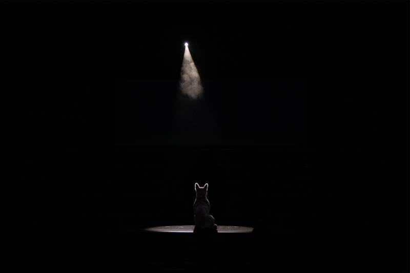
The first photo was “Frenchie in the Spotlight”. This was a good start, because it’s a minimalist black-and-white photo. With its simplicity, it didn’t take that much time to edit. I just slapped a photo of a french bulldog on an empty stage, did a little shading, and voila… it’s done.
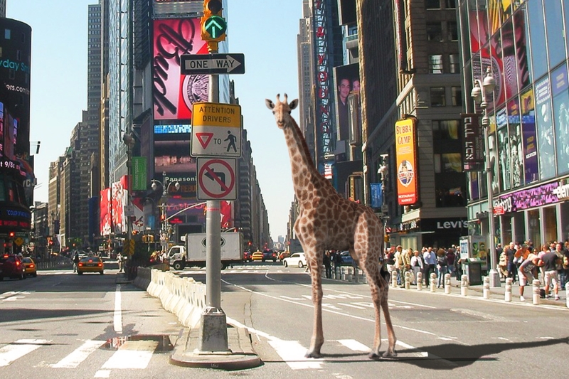
The second photo was “Giraffe in Times Square”. This one was a lot harder to create because I can’t seem to blend the animal with the background. I tried adding highlights and shadows, but the giraffe still looked out of place. There must be a better way to edit this, and I am sure a lot of Photoshop masters out there could fix this in a jiffy. But I’m pretty pleased with the result, especially since the giraffe looks like a tourist taking photos in Times Square. I could have sworn that I have a similar photo from a trip to New York many years ago (with my sunglasses and my “I Heart NY” t-shirt).
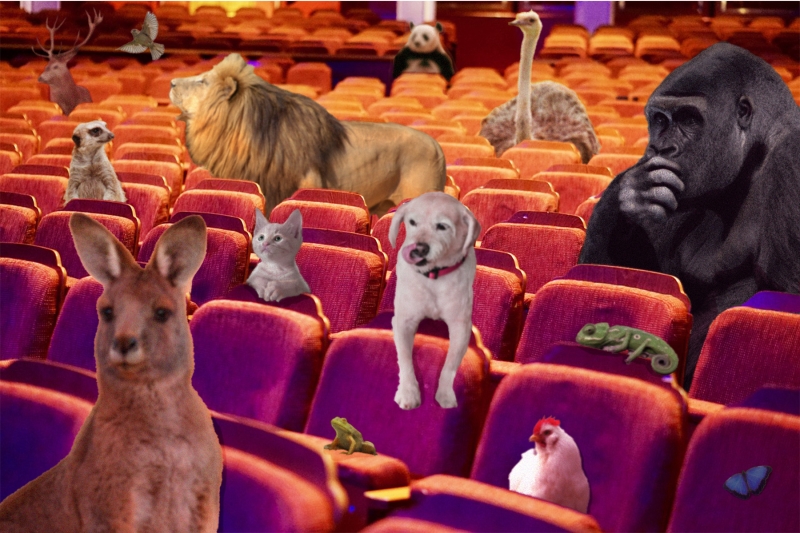
The third one is the most complicated one. I call it “Chaos in the Theater”, and I think the photo lives up to its name. It took a very long time to edit because I kept wanting to add more and more animals. I had to edit each animal individually. It was a tedious job, and the result could be better if I had more skills. But I had a blast, so I’m not complaining. One thing though, if this photo was real, can you imagine how this theater would smell like? And if you are an usher, how would you handle such audience members?
In the end, my Photoshop journey is far from over. There is still so much to learn. I still don’t know how to make myself five years younger or ten pounds lighter in a photo. But now I know how to lay out a cover of a magazine or make a simple poster. As many experts say, to be good at something, you have to be bad at first. The summer is not over yet, so I still have a lot of free time to improve. In the meantime, should I put an elephant in the Phantom’s costume?

Videos
