Review: LA TRAVIATA with Philharmonia Orchestra Of New York - Innovation for Innovation's Sake

As the 21st century continues to necessitate the innovation of classical music presentations, it's paramount that a keen eye remains fixed on the purpose of this innovation. Innovation for innovation's sake will fail every time. And, unfortunately, Philharmonia Orchestra of New York (PONY) fell victim to this pitfall with their recent production of La Traviata.
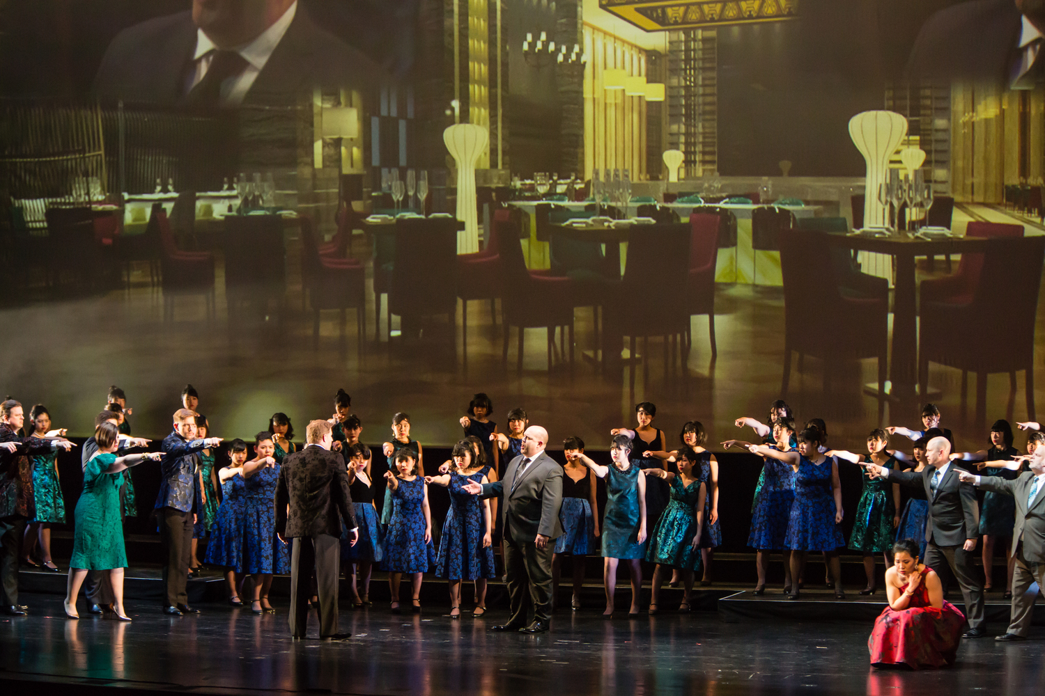
PONY has become known for its use of projections in their concerts. The intention is to "create a new form of entertainment that can be enjoyed by many demographics." Unfortunately, in this production, there was nothing enjoyable about their integration. They were messy, disjointed, and an affront to the music of Verdi. Coco Chanel said it best: "Before you leave the house, look in the mirror and take one thing off." It would have served the production if the creatives had channeled even an ounce of the goddess of style and taste. Unfortunately for the audience, they did not. One 3-minute scene contained 90 different cues. 90. In 3-minutes. This is not an exercise in innovation, but in peacocking the possibility of what can be done - innovation for innovation's sake - and the production suffered because of it.

At its core, the idea of integrating projections is a good one, but it must be done with cohesive vision - and with taste. It felt like we were watching a demonstration of the myriad capabilities offered by a design program instead of a realized production intended to tell a story. The experience reminded me of a coffee date I once had with a friend. She was halfway through sewing in her new weave when she lost track of time. Not wanting to cancel, she threw a wig on over her unfinished hair - but it didn't look right. So, she threw a hat on top of that. Still not convinced by the shape the half-finished weave, wig, and hat offered, she threw a scarf over the mountain on her head and tied it around her chin. This dear friend showed up to coffee looking like a beautiful conehead - cheekbones for the gods, but some sort of growth precariously emerging atop her head, drawing far more attention than the half-finished weave ever would have. This production was going to coffee with that conehead friend. Take the scarf off, take the hat off, and if the wig looks lumpy, take it off - let us enjoy the beautiful music, the equivalent to my dear friend's beautiful face.
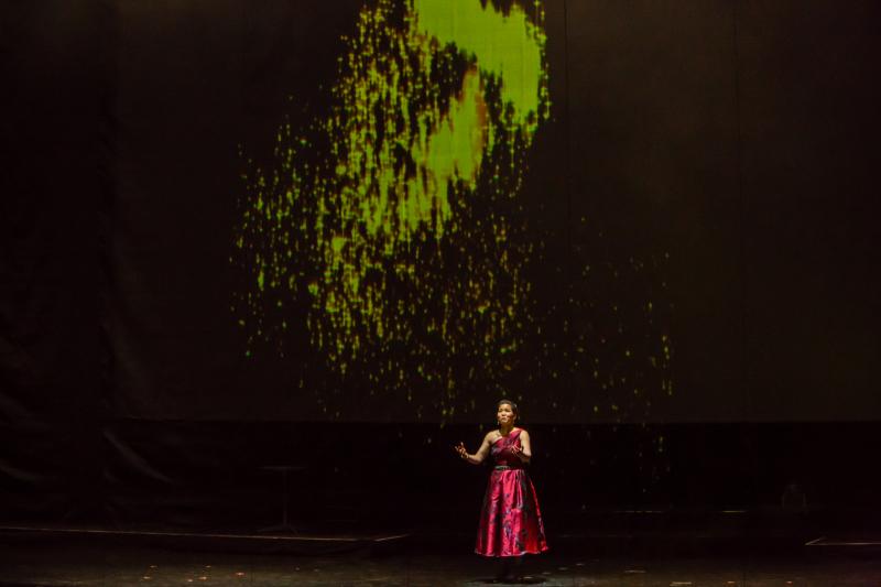
In addition to their overall lack of effectiveness, there was a scrim hung at the farthest point downstage serving to 'catch' the images as they were cast on top of the singers. It created a visual barrier that skipped around the stage hand in hand with the projections to obstruct the story vs. propel it. Had there been a cohesiveness to the projections, or had they served a clear purpose, perhaps the impediment wouldn't have felt so cumbersome - but that was not the case. The images were disparate and oscillated between realism, glittery orbs whose likeness mirrored something out of Disney's Cinderella, and Sims-like computer renderings. The manic swings confused any clear artistic vision and highlighted the lack of artistic autonomy.
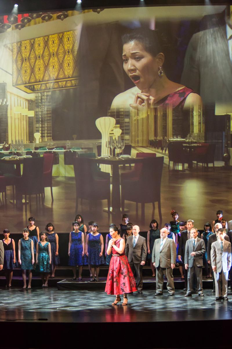
There were certain projection elements that, with tweaks, could have proved a great  service to both the singers and the production. For example, once the lights lowered, the plot for each act was projected with a Star Wars "A long time ago, in a galaxy far, far away..." treatment. However, the act 2 projection moved so fast it made me nauseous and the act 3 plot projection was actually the plot for act 2. I wish more time had been spent perfecting these than on the projection of a cat that slowly meandered through the house in act 2 - a cat whose purpose is still unclear to me. Another treatment that could have been used to great effect was projecting close-ups of the singers' faces on the screen behind them. In the first act, there was something cinematic and rock-star-esque about it. It solves the issue of sitting in a 'bad seat' and creates visual variety in a society that can barely sit through a two minute YouTube video without getting bored. However, as the opera progressed, this treatment became increasingly clunky and eventually served as a painful reminder that Violetta almost never looked Alfredo in the eye - an odd choice for a woman in love. The best use of the projections was the advertisements played during the intermissions. It was a genius monetization tactic - one that other companies should consider exploring.
It's a shame. If only someone had looked in the mirror and taken off the last 89 things they'd put on...maybe it would have been ok.
Photo credits: ed Lefkowicz
Reader Reviews
Videos

