Broadway By Design: Katz, Lien, Sosa & Steinberg Bring SWEENEY TODD from Page to Stage
Sweeney Todd is currently running on Broadway at the Lunt-Fontanne Theatre.
In Broadway by Design, BroadwayWorld is shining a spotlight on the stellar designs of this Broadway season, show by show. Today, we continue with the creatives from Broadway's most beloved thriller, Sweeney Todd- Scenic Designer Mimi Lien, Costume Designer Emilio Sosa, Lighting Designer Natasha Katz, and Sound Designer Nevin Steinberg.
Stephen Sondheim and Hugh Wheeler's landmark musical tells the tale of a resourceful pie shop owner and a vengeful barber out for blood. After he's sent away by a corrupt judge, Sweeney returns to London years later seeking his long-lost family, and forms an unlikely partnership with Mrs. Lovett, who serves up pies underneath his former shop. Together, they wreak havoc on Fleet Street and serve up the hottest - and most unsettling - pies in London.
Where did the design process begin? For Lien, it was the opening text. "I still have a piece of paper taped to my studio wall that says: 'There's a hole in the world / Like a great black pit / And it's filled with people / Who are filled with shit / And the vermin of the world / Inhabit it...'
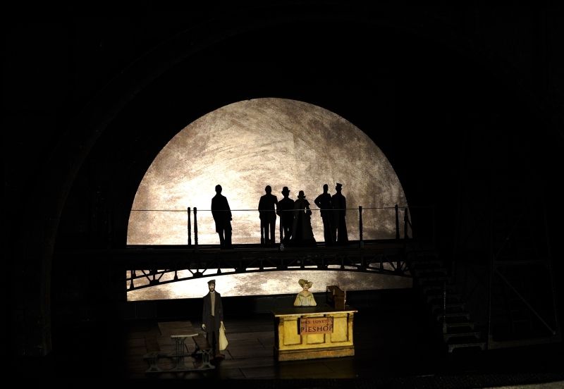
"For me, those words conjured the entire physical, psychological, and emotional world of Sweeney Todd. The overriding image, and ultimate container for the piece, was the modern industrialized CITY - a great black pit where humanity is piled on top of one another, where there is a stratification of both society and its infrastructure into vertical levels. Bridges overhead and sewers underground. The privileged and beautiful above, and the vile, downtrodden workers below..."
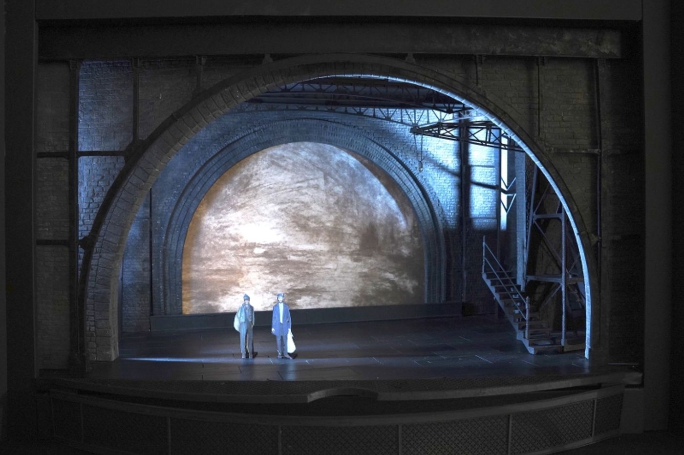
"Although Tommy and I set out to evoke places that are thought of as somehow 'terrible' (sewers, factories, furnaces), we also felt that there is much beauty in the grotesque," Lien explained. "I have always subscribed to the theory of the Sublime - that which is terrible is also simultaneously beautiful, not in spite of its terrible-ness, but by the very fact of it. I set out to create a gritty world of infrastructure that nevertheless still held romance and longing within.
"In terms of art historical references, I drew a lot of inspiration from the work of the Italian architect Piranesi, who made an incredible series of etchings depicting fictional underground prisons, and the paintings of JMW Turner, whose paintings spanned the industrial revolution, and went from naturalistic to very expressionistic depictions of the burgeoning industrial landscape."
Sound designer Nevin Steinberg built from there. "I challenged myself to approach Sweeny with all of the respect it deserves as the masterpiece it is, while still considering it from the point of view of a new musical, a new production," he explained. "So, I loved reading the original penny dreadful and the Christopher Bond play, and I was very inspired by Mimi's scenic design and the scale of the physical production. I wanted the sound of the show to reflect the size and geometric depth and volume of the set."
Katz's lighting inspiration started with director Tommy Kail's vision. "There is tremendous sorrow and humanity in the show, which I wanted to convey in the lighting," she explained. "It's a tale of light and dark: the light and dark of human nature, the light and dark of day and night, the light and dark of the haves and the have nots, the light and dark of love and revenge, etc. And the music! The incredible layered music and lyrics directly inform the visual tale.
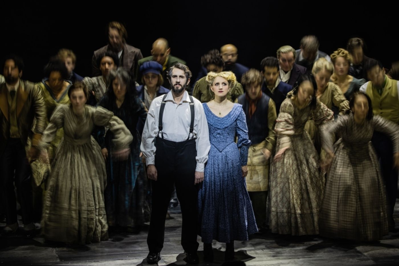
"We see the shadowy underbelly of London's streets and the smoky, putrid air of looming smokestacks. We feel the breathing of life in the city contrasted with the sinister stillness of death. The lighting varies in tone with the score, from spooky and eerie, to light and airy. I used shafts of light to pierce through the darkness like threatening knife blades, while at other times the shafts of light gently permeate through the darkness as if there is a way out. At times a sense of hope and other times, no hope at all."
Sosa's costumes were also inspired by the show's setting. "I was heavily inspired by London in early 19th century during the Industrial Revolution, with everything covered under a layer of soot from all the city chimneys and flashes of color in unexpected places."
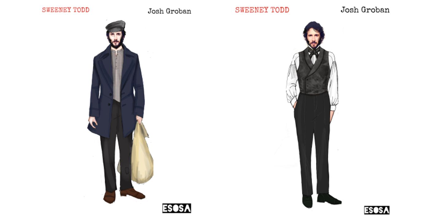
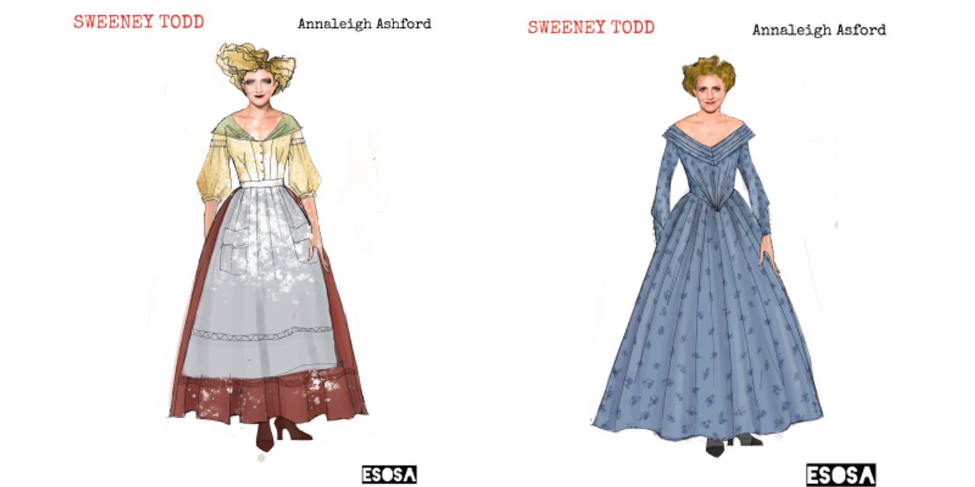
"My biggest challenge on this project was how to edit myself," Sosa continued. "Historically this period can be very fancy and frilly, which is in my wheels house. But for this production I wanted to create beautiful period clothing with a sinister edge."
"I spent a lot of time thinking about how to communicate the orchestral sound to the audience in a way that felt alive, authentic and spacious," said Steinberg. "While 26 is quite large by Broadway standards, I feared it might feel small to audiences who are used to hearing Sweeney in a symphonic environment. Luckily, the original Jonathan Tunick orchestrations stand brilliantly on their own, conducted with such care by Alex Lacamoire and played with great sprit by the fantastic orchestra!"
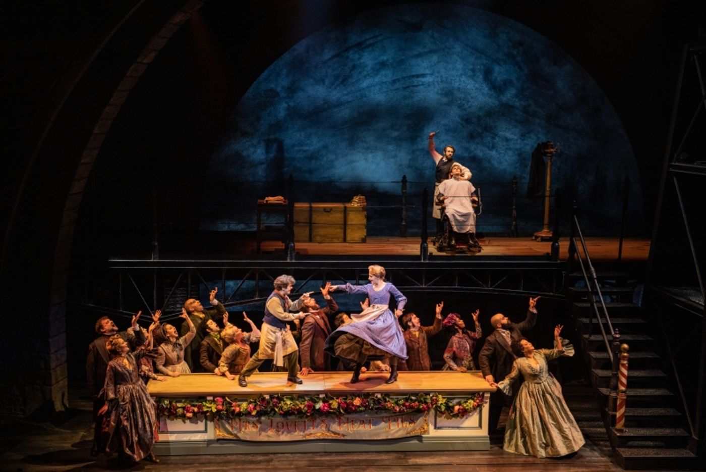
Lien's biggest design challenge was a more practical one. "[It] was the barber chair trick - figuring out the logistics (and logic) of the sequencing, going from the chair delivery by the crane, to setting the chair on the bridge, to the victim sliding down out of sight, to the books coming out the chute door down in the bakehouse below," explained. "It has to work in a certain way, but I also wanted it to remain a bit enigmatic - so you don't immediately know what the path is. The relationships between the set elements becomes more non-literal in Act 2, a bit dismembered - so the oven, chimney, and bakehouse are all there onstage, but connected by spatial poetics rather than literal architecture."
"My biggest challenge was to visually convey all the different facets of Stephen Sondheim's Sweeney Todd," added Katz. "To honor his work and his artistry. It's a daunting just thinking about it even now."
Sweeney Todd is currently running on Broadway at the Lunt-Fontanne Theatre.
Videos


